

 Calendar
The tour calendar view displays saved tours in a calendar layout, the tours are filtered by the selected person and the selected tour type.
This view can be opened from the menu Directory/Calendar.

Calendar View Design
The CalendarView is designed to work in two different layout models, each of which has its own customization. The switching between the layouts is done automatically based on the width of the Calendar.
|
|
|
|
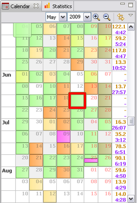
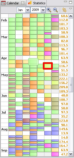
- The normal layout shows each day with a header and each tour for that day with the configured information. This view should give you an overview over the weeks.
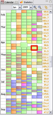
- The tiny layout shows days as simple boxes and all tours for that days as a colored rectangle always filling up a complete day box. This layout is mainly indented to serve as a general quick tour browser. Using this layout it should be no problem to display several years of data in one window.
Beside that normal / tiny layout switch some other elements of the calendar are shown/hidden/changed (e.g. week summary) according to the CalendarView size.
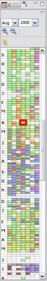
Hint: You can run the CalendarView in the "tiny" layout as a general tour browser and use the maximize function (Ctrl-M or double-click on the view tab) to quickly switch to "normal" layout and back again. This should work seamlessly.
Navigation
The CalendarView supports several input methods for navigating the tours each of which will get explained in detail below:
- Year/Month Combo Box
- Scroll Bar
- Keyboard
- Mouse Wheel
- Context Menu
Year/Month Combo Box
As you navigate the calendar those combo boxes are always updated with the month and year of the first week displayed in the calendar. Simply change the month and year to switch to that date.
The year drop down content is determined by the oldest tour in your database. If you want to go to a year not contained in the drop down simply put the cursor in the combo box, enter the year manually and press ENTER.
Scroll Bar
The scrollbar tries to do something impossible: The slider size is reflecting the displayed fraction of time from all time containing tour data. For that reason the scrollbar is representing a defined time interval. Still the slider enables you to scroll in both directions (past, future) infinitely. That might sound a little bit confusing but I think in most cases behaves like the users expect.
Clicking the small arrows scrolls by weeks, clicking the bar by pages and dragging like explained above.
Keyboard
My favorite way of navigating the calendar. The way the keyboard navigation works depends on whether a tour is selected (red border) or not. Day selection is currently not support what means for the keyboard navigation it makes no difference if a day is selected (blue border) or nothing is selected at all.
|
Keys |
Tour Selected |
Action |
|---|---|---|
|
UP-Arrow, "k" |
no |
Go one week into the past. |
|
yes |
Go to the previous tour in the calendar on the same weekday as the currently selected tour. If no such tour is visible scroll one week into the past. |
|
|
Down-Arrow, "j" |
no |
Go one week into the future. |
|
yes |
Go to the next tour in the calendar on the same weekday as the currently selected tour. If no such tour is visible scroll one week into the future. |
|
|
Right-Arrow, "h" |
no |
Select the newest (latest) tour in the calendar. If no one exists scroll one week into the past. |
|
yes |
Select (go to) the chronological previous tour. If no one exists scroll one into the past. |
|
|
Left-Arrow, "l" |
no |
Select the oldest (first) tour in the calendar. If no one exists scroll one week into the future. |
|
yes |
Select (go to) the chronological previous tour. If no one exists scroll one into the past. |
|
|
HOME, "." |
yes/no |
Go to today. |
|
END, "," |
yes/no |
Go to first (oldest) tour in the database. |
|
ESC |
yes |
Deselect tour. |
|
no |
Does nothing. |
|
|
SPACE |
yes |
Deselect. |
|
no |
Like Arrow-Right and "h". |
|
|
PAGE-Down, "n" |
yes/no |
Go to next page. |
|
PAGE-Up, "p" |
yes/no |
Go to previous page. |
|
"i" |
yes/no |
Zoom in / display less weeks. |
|
"o" |
yes/no |
Zoom out / display more weeks. |
To summarize the important ones:
- Up/Down (j/k) scroll either calendar or tours of weekday (depending on selection)
- Left/Right (h/l) scroll tour by tour
- And don't forget the handy i/o keys: keep then pressed to zoom continuously.
Hint: Keys not working? Does the Calendar own the focus? Simply click in the calendar.
Mouse Wheel
Very likely the most commonly used (and less tested) navigation. The scrolling behaviour depends on:
- The position of the mouse pointer
- Whether a tour is selected or not
If the mouse pointer is on either the first column (week info) or the last column (week summary) the scrolling behaviour differers from the one where the mouse pointer is over a weekday. That means that some scrolling behaviour is not available any more if the first and last column are both not displayed due to a itty-bitty calendar view (what should not cause an principle problems).
|
Mouse Position |
Tour Selected |
Action |
|---|---|---|
|
Week Day |
yes |
Select (go to) the chronological previous/next tour. If no one exists scroll one week. |
|
no |
Scroll one week. |
|
|
Info/Summary Column |
yes/no |
Scroll one page. |
Context Menu
If you want to navigate via the context menu make sure that you are not selecting a tour what means that you are not clicking on a tour. Clicking on the Info-/Summary Column or an "empty" day with the right mouse button will allow you to go back/forward one page or go to "today".
Configuration
The calendar layout can get customized via the view menu (small triangle in the top right corner of the view). The menu content depends on the current layout model:
Normal Layout
|
Menu Item |
Action |
|---|---|
|
#. Summary Line Info |
Defines the week summary info displayed in the corresponding line in the week summary column (the column right of the week). |
|
Use Line Color for Summary |
Normally the week summary is rendered in the "Text Color" which are defined for the data type (Preferences → Appearence → Colors). Those colors are mainly adjusted to look nice on a gradient fill with the gradient colors defined for that data type. Using the "Line Color" might look much nicer for the week summary which is displayed on a white background. |
|
#. Tour Info Line |
Defines what info for a tour is displayed in the corresponding line within the tour box. |
|
Display all Tours max. Size Display# Tours per Day |
Here you define how the tours are rendered within a day:
Note: The current implementation resizes tours so that always all tours are displayed. That means if you choose "Display 2 Tours per Day" but the day is containing 3 Tours the height of a tour will be 1/3 so that all tours are displayed and no tours are hidden. For that reason in the current implementation "Display all Tours max. Size" == "Display 1 Tours per Day". |
|
Use Color for Text |
Use the color defined in "Preferences → Tour Type Filter → Definition → Text Color" for rendering the tour info text in the tour box. |
|
Highlight Text in Black |
If checked the text of highlighted tours (mouse pointer on tour) is rendered in black. That looks nice if you have dark colored text on light colored boxes but renders text unreadable if you use light text color on dark colored boxes. |
Tiny Layout
|
Menu Item |
Action |
|---|---|
|
#. Summary Line Info |
See above. |
|
Use Line Color for Summary |
See above. |
|
Show date in Tiny View |
If checked a transparent day number will be rendered on each day box. |
Tool Bar
Beside the combo boxes explained above the tool bar contains the following items:
- Magnifier Glass
- Zoom in and out of the calendar aka show less or more weeks. Please remember the more convenient way of doing this using the "i" and "o" keys. Further note that the number of weeks displayed is a separate option for the normal and the tiny layout, meaning the setting is saved for both layouts independent.
- Link Switch
- If the "Link" is set to ON the calendar will automatically update the display to always select and display tours selected in other views (e.g. tourbook)
Context Menu
Right click on a tour invokes the context menu for that tour. This menu is the same as the one used in the tourbook except for the "Delete Tour" entry missing. If you want to delete a tour you still have to go to the tourbook and do the deletion there. Sorry.
Misc
Note that the double click action for a tour is defined here:
Preferences → Views → View Actions → Double Click
Compatibility Problems
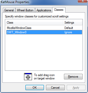
When the tool KatMouse is used, scolling the calendar entries is not always working correctly. There is an option in this tool to disable it for a specific window.
When KatMouse is disabled for SWT_Window0, then scrolling the calendar view works correctly.
This page is updated for version 14.7
